5 Tips for creating an Awesome Navbar
Here are 5 tips for improving the design of your navigation menu.
- Keep it simple The key to an effective navigation menu is to keep it simple. No matter how many content categories you have and how many pages you might need to link together, don’t ask too much from your users. Depending on the complexity of your website, this can be the most tricky part of your whole design.
- Use Clear wording Try to use wording that your users are familiar with. Again, ask your visitors for help and make sure your navigation menu is in line with their mental schemata. Don’t invent creative categories just for the sake of being creative. Choose wording that is simple and to the point.
- Place main navigation menu at top The position of your navigation menu is very important. There are two reasons for that. First of all, people tend to follow certain patterns when they first take in your site.This means, we focus the most on the top of a website and on the left side from where we briefly scan the main elements in the content area.
- Consider responsive design Tablets and smartphones are becoming our default choice for connecting to the internet.Just keep in mind that small screen sizes also require a responsive solution for your navigation menu. The desktop version of a website offers enough screen real estate to feature multi-layered navigation menus. However, the smaller the screen, the more difficult it gets to display the same content in a clear and usable way.
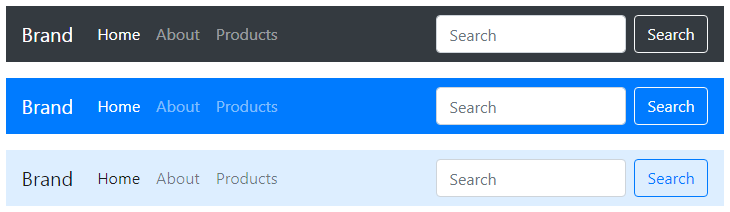
- Use a Framework Use a framework for designing a navbar. It makes the work a lot more easier. A good framework would be Bootstrap. It is one of the most starred repository on Github. Using bootstrap is also very easy.
Hoping that you will create an awesome navbar for your website.
0 Comments